
By Catherine Austin Fitts
My “go to” website for technical analysis of precious metals, the US dollar & the US stock market is Rambus Chartology, where Rambus (that’s his handle – he’s the founding technical analyst) leads a discussion with extensive charts of what the markets are saying.
In January 2016, Rambus launched his quarterly Solari Report with a Blockbuster Chartology. You can find links to the entire series of quarterly and annual Blockbuster Chartologies at the end of this latest piece.
One of the reasons that Rambus is so good at his craft is that he focuses on “staying on the right side of the major trend.” The challenge of doing so at this time is that it is tempting to look for bottoms or to assume that the trend upwards in the US dollar or stock market may be over. However, Rambus consistently brings us back to the discipline of the Chartology. What does price tell us? As he describes so aptly, we are dealing with psychological warfare.
Sitting back once each quarter to get this perspective offers invaluable insight. So, here we go for the 1st Quarter 2023 Wrap Up Blockbuster Chartology!
Blockbuster Chartology Quarterly Report
By Rambus
~ 1st Quarter 2023 Wrap Up ~
Published on May 12, 2023
US Stock Markets
US Dollar
Gold & Silver
US Stock Markets
My main focus since the beginning of 2023 has been primarily in the Precious Metals complex which is looking very interesting once again since the August 2020 high. In this Weekend Report I would like to update some long term charts for the US stock market indices as there is some important Chartology that may be ready to give us a strong warning that the bear market rally that began at the October 2022 high is getting close to ending.
If you have ever experienced trading in a real bear market like the one that started at the 2000 secular bull market high, led by the tech stocks or the 2008 bear market that was encompassed by the banks and housing stocks, then you know how frustrating it can be during bear market rallies.
Bear market rallies are designed to make you think the bear market you were initially looking for has failed because the countertrend rally has been so strong. You begin to question yourself and your initial reasons for the bear market that looked so promising not that long ago. Then about the time you throw in the towel the bear market you were looking for springs back to life and leaves you scratching your head. The markets have an uncanny ability to take you right to your psychological limit and then some, which often causes one to act at the the very worst time.
Most of the charts to follow are longer term in nature with some showing the secular bull market that began at the 2009 crash low and ran until the top in 2022 for most of the indexes. Some are much shorter in duration showing just the price action since the 2020 crash low. Keep in mind there is still more work to be done, but the big picture since the 2022 high still shows a bear market top in place with the nearly 8 month countertrend rally that appears to be concluding in the not too distant future.
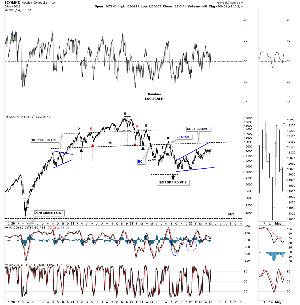
This first chart is a weekly look at the COMPQ, tech stocks index, which shows the 2020 crash low and the very strong two year bull market that at this point came to an end in late fall of 2021 with the formation of the H&S top. As you can see there was a nice clean backtest to the neckline before the move down into the October low. Since the October low the price action has been slowly grinding higher frustrating both the bulls and bears alike.
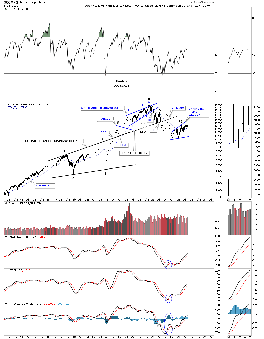
This next weekly chart for the COMPQ shows the very large bullish expanding rising wedge which was the last major consolidation pattern that formed in the 2009 secular bull market. Part of that large topping pattern was the blue 5 point bearish rising wedge reversal pattern which really got the ball rolling to the downside. Note how the top rail of the black bullish expanding rising wedge ended working as a Support and Resistance line when the neckline gave way as shown by the Top Rail Extension line.
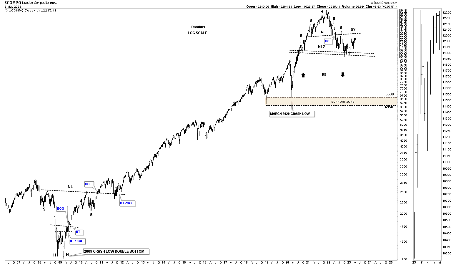
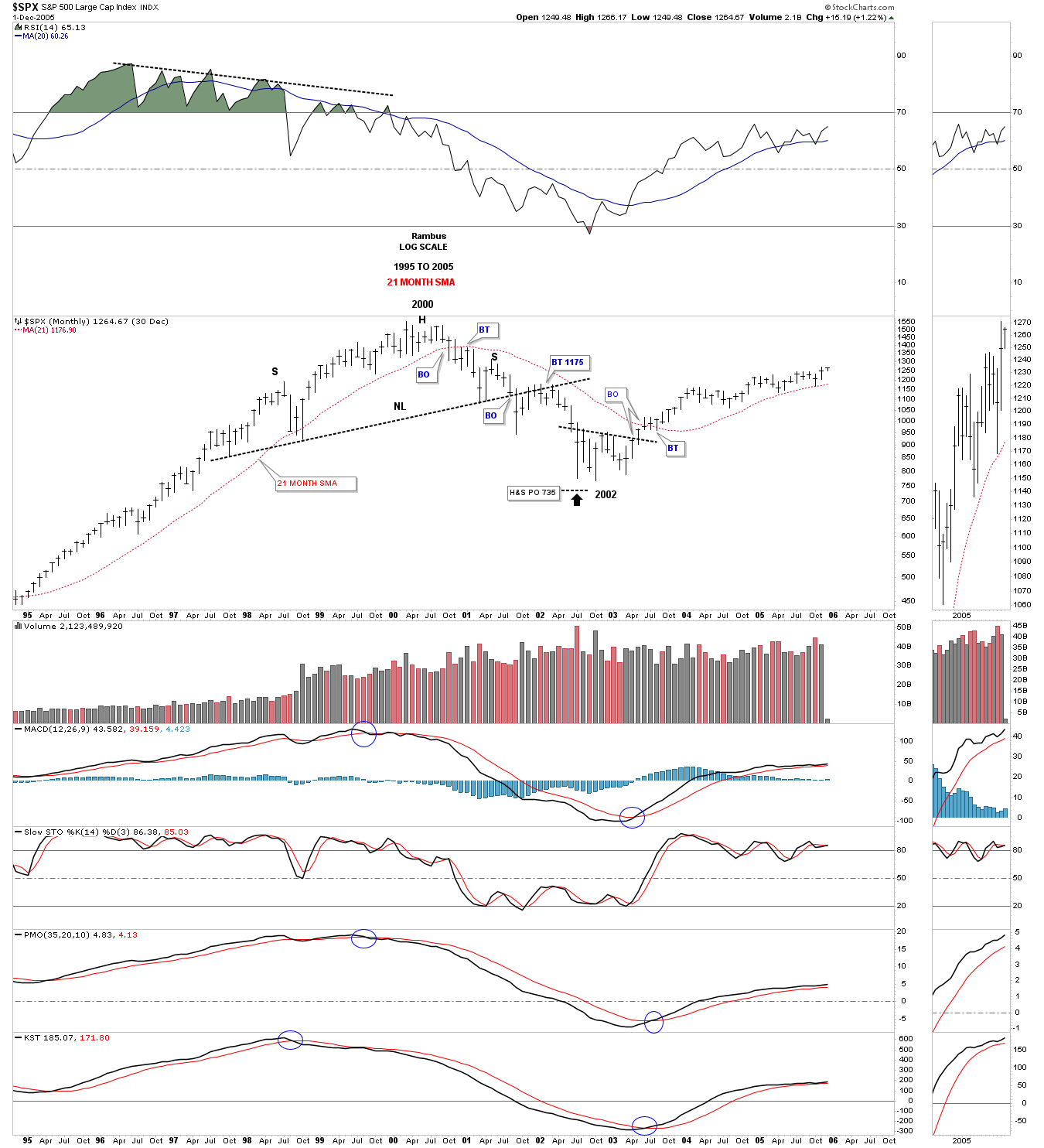
I intentionally left all the consolidation patterns off of this weekly chart which shows the secular bull market that began at the 2009 crash low. The bear market that actually began in 2007 ended in 2009 produced a pretty symmetrical H&S bottom. After a nearly 13 year bull market along came the 2022 H&S top which was needed to reverse the secular bull market.
One of the hallmarks of a bull market coming to an end is when the last phase takes hold which pushes prices up in a near parabolic manner. Note the angle of the bull market from the 2009 low to the pandemic low in March of 2020. Now compare the angle of the rally out of the 2020 pandemic low to the previous bull market years. That two year rally out of the 2020 low went nearly vertical before the topping action began. When the tech bubble ended in 2000 the blowoff phase actually began in 1995.
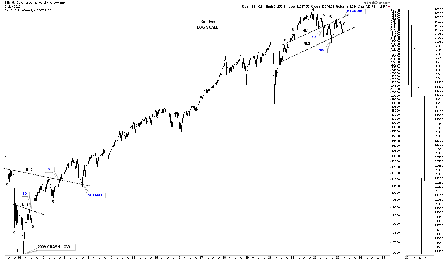
This daily chart for the INDU shows the rally out of the 2020 low to the 2022 high with the side ways trading range under construction.
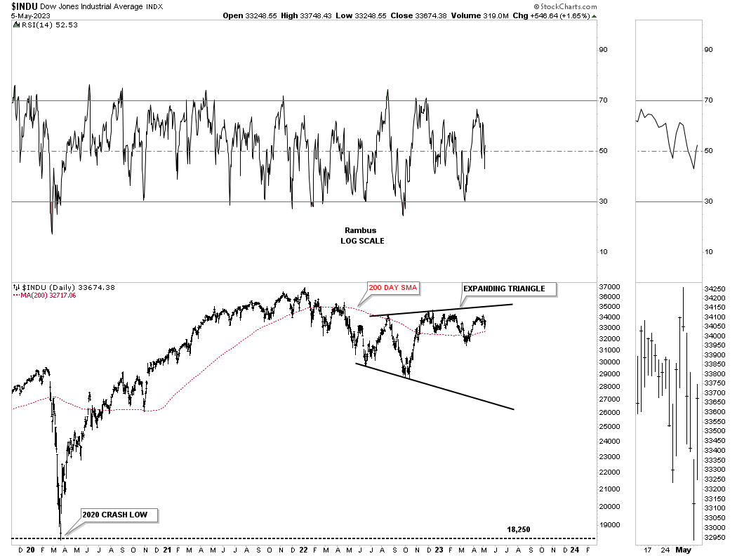
At the 2009 bear market low the INDU formed a double H&S bottom which led to its bull market rally.
Moving on to the NYA, which is a broad measure of stocks, you can see its 2009 bull market uptrend channel on this monthly line chart. The top rail was hit once again at the 2022 high where the H&S top formed. At a minimum I would expect to see the bottom trendline hit once again at some point in the future.
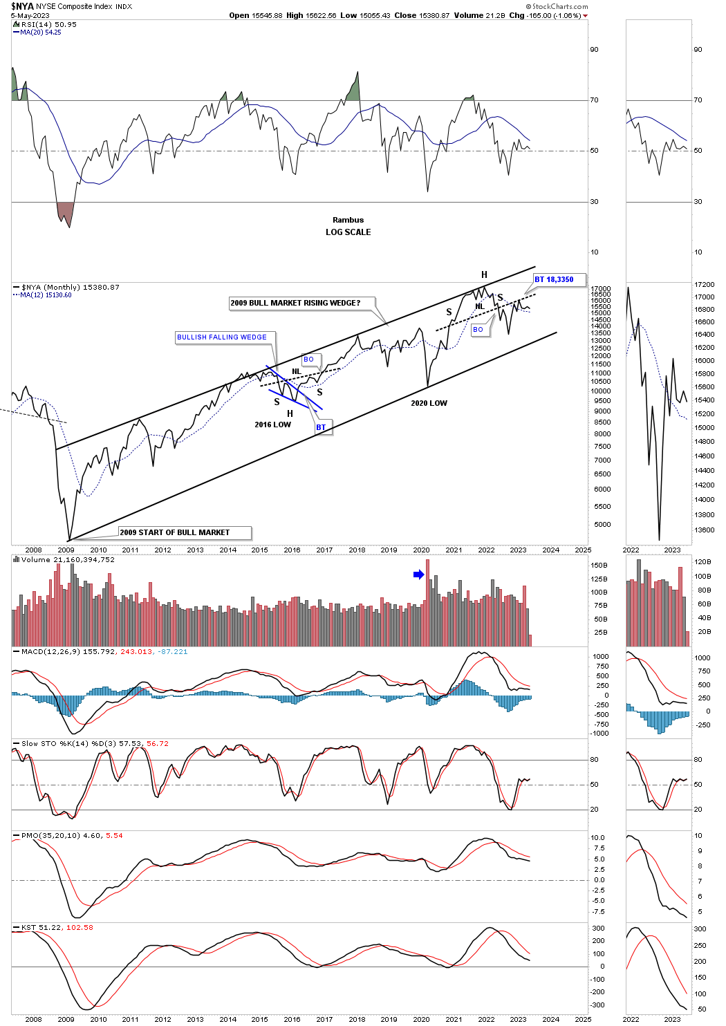
The NYA secular bull market.

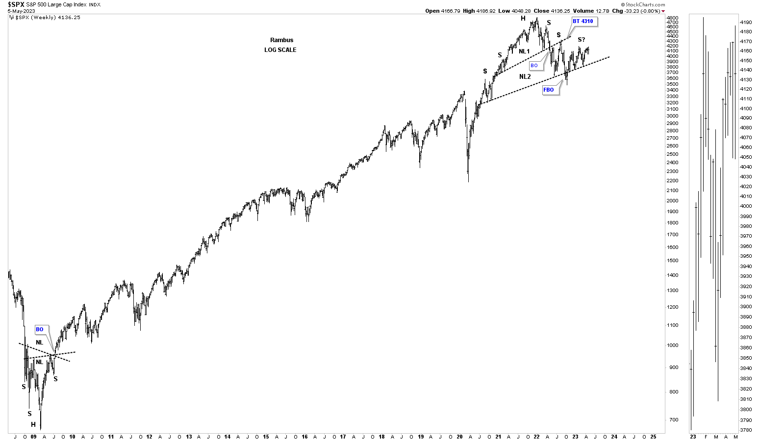
Moving on to the SPX you can see the rally out of the 2020 low to the top in 2022 where the head of the H&S top formed. Here you can see the laborious rally out of the October low with slightly higher highs and higher lows.
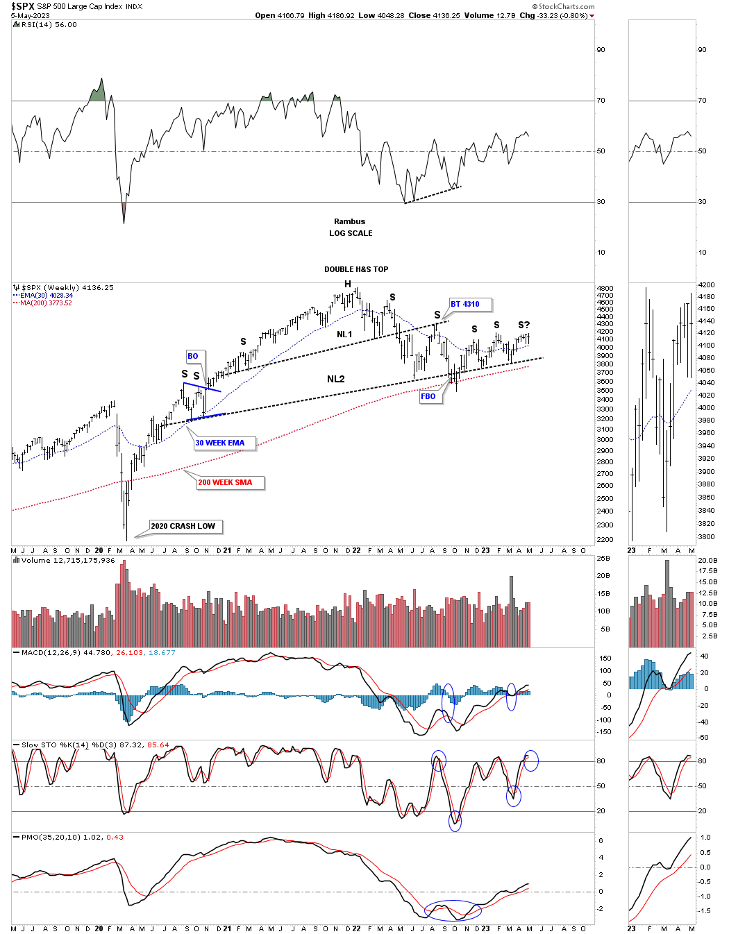
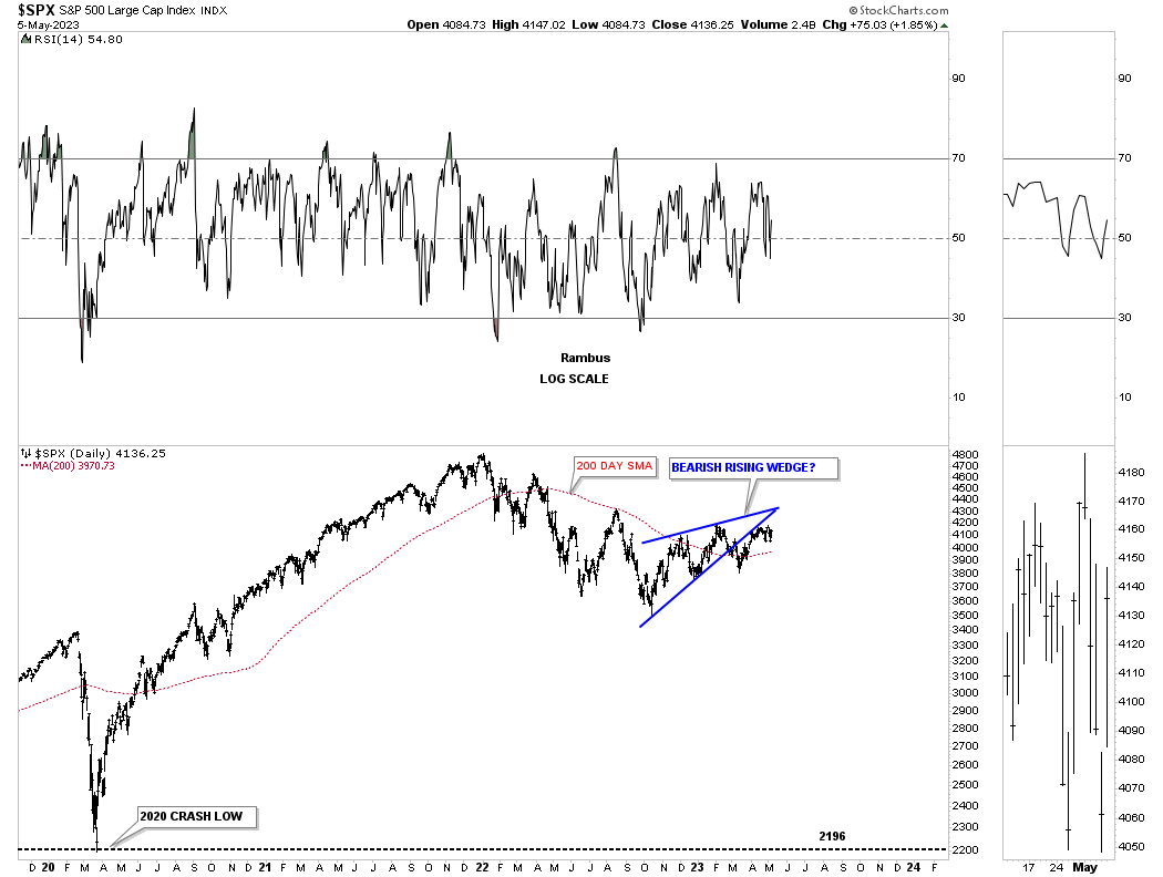
This daily chart shows the rally out of the 2020 crash low to the high made in 2022 and the decline that has followed. Since the October 2022 low the SPX has been forming the blue rising wedge which I’m looking at as the first real consolidation pattern.
Next I would like to show you a monthly chart for the SPX that I use for long term buy and sell signals using the 21 month sma. It is a totally mechanical system with no emotions to get in the way and is very easy to understand. A buy signal is given when the SPX closes above the 21 month sma on a monthly closing basis. It doesn’t make any difference what the SPX does during the month it is only the monthly closing that counts. When the SPX closes a month below the 21 month sma you have a long term sell signal or go short signal. There can be a whipsaw once in awhile, but they generally last for a month or so.
The big blue circles shows the last long term buy signal that was given a month after the 2020 crash low that lasted for two years until May of 2022 when it gave a long term sell signal which is still in play. You can see the SPX is flirting with the 21 month sma currently, but where it closes at the end of May is all that is important.
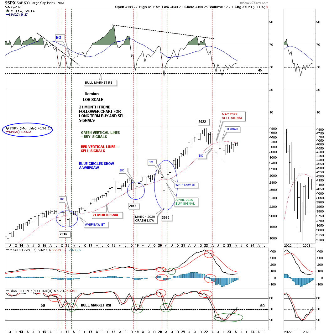
How would the 21 month sma worked out at the secular bull market top in 2000? Just follow the price action along with the 21 month red sma to get your answer. Note where the SPX crossed below the 21 month sma with four months of backtesting from below. That sell signal or short signal stayed in place until the SPX closed above it at the 2002 bear market low.
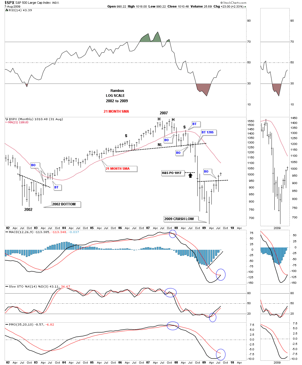
How would it have worked during the 2008 bear market? Again just follow the price action and the 21 month sma. The sell signal came on the first monthly close below the red 21 month sma with five months of backtesting from below. You would have gotten out in plenty of time to save your capital. The Chartology also showed the unbalanced H&S top as a secondary indicator to get out.
This next chart for the SPX shows its secular bull market uptrend channel with the throw over or bull trap just before the 2022 high was made. I wouldn’t be surprised if we see the bottom rail of the 2009 uptrend channel hit at some point.
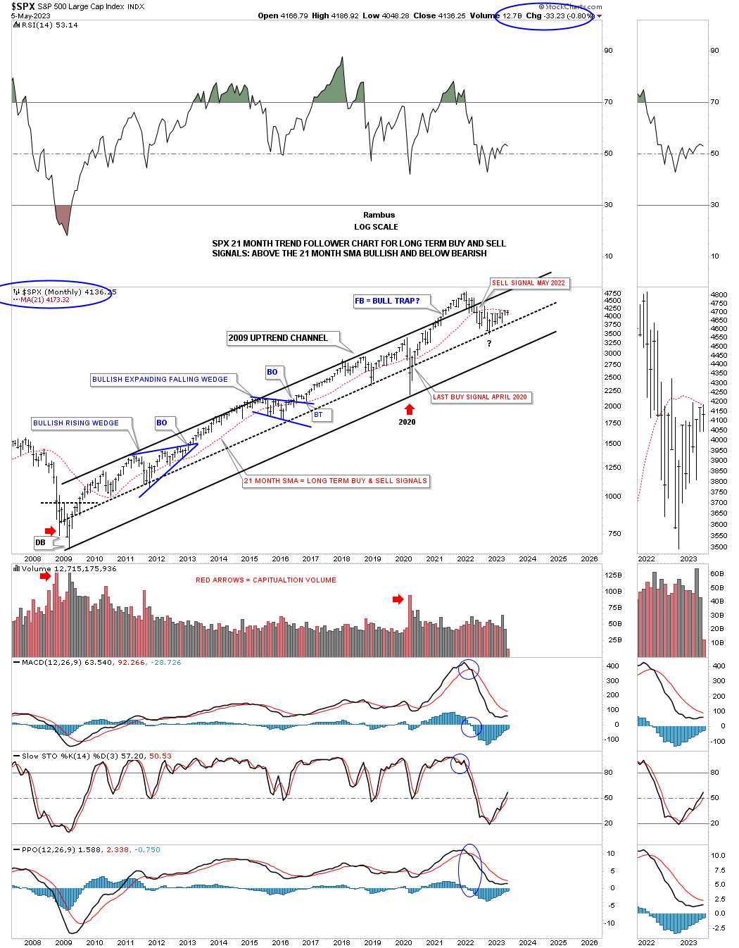
The SPX secular bull market with a H&S bottom at the beginning and a H&S top at the end.
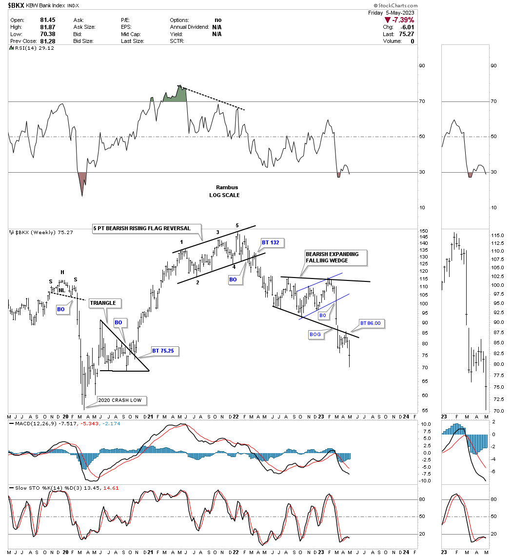
If there is one sector that can lead to bull or bear markets the banking sector is one to keep a close eye on. Below is the history chart for the BKX, bank index, which shows all the important chart patterns. One of the largest topping patterns I’ve ever followed in real time was the five point bearish rising flag reversal pattern that took nearly 20 years to complete. The breakout finally occurred in 2008 which led to the financial crisis bear market with the capitulation low in 2009.
During the bull market that followed the BKX formed two bullish expanding falling wedges which is one of the most bullish consolidation pattern there is. What makes this pattern so bullish is when you get the upside breakout, is the fact that the last reversal point low is so much lower than the previous low. This takes out all the sell/stops and leaves no sellers left.
Now I would like to bring your attention to the 2022 all time high and another 5 point bearish rising flag reversal pattern that we’ll look at in more detail on the following chart below. After breaking down from the five point bearish rising flag the BKX formed an expanding falling wedge exactly like the ones that formed during the bull market years. The difference being the breakout came to the downside which is when the current banking crisis started to show itself.
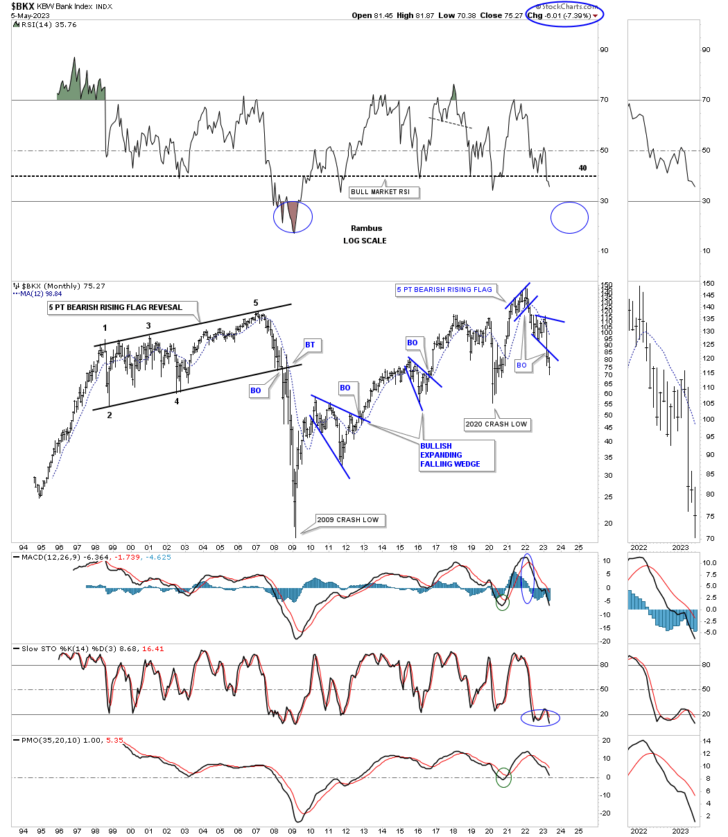
Now lets look at a much shorter term time scale so you can see the five point bearish rising flag reversal pattern up close and personal. This five point rising flag reversal pattern is pretty much a fractal to the 20 year bearish rising flag we looked at on the monthly chart above.
This weekly chart also shows you the bearish expanding falling wedge which had the breakout and then the backtest three weeks ago and made a new weekly lower low last week. With the breaking out and backtest process just completing the next impulse move to the downside is just getting underway. It would be hard to imagine a new bull market in the stock markets taking hold with the banks making new lower lows.
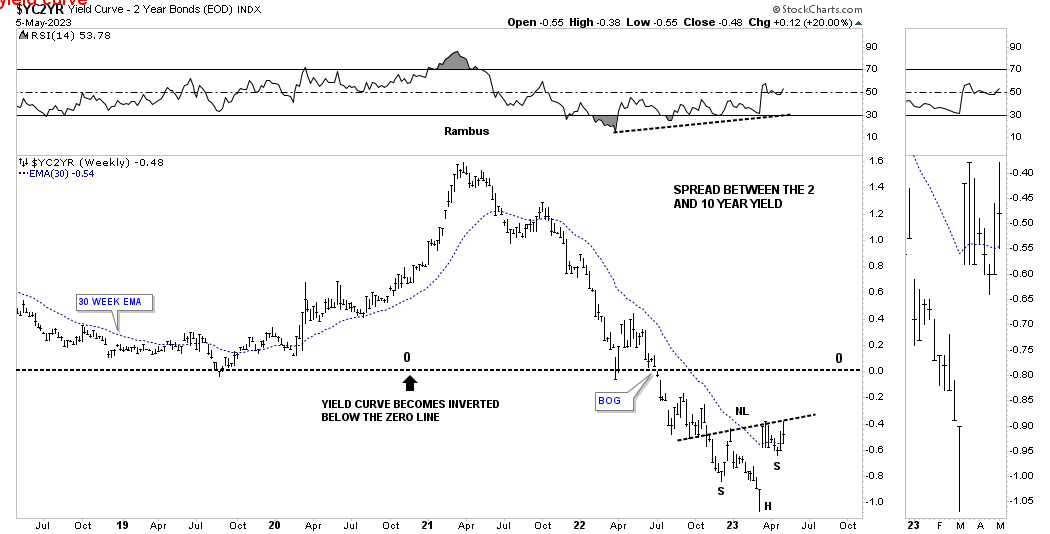
These last two charts for tonight show the inverted yield curve when the spread between the 2 year yield and the 10 year yield crosses below the zero line. The brown shaded areas show the previous times this has occurred. Note the 2000 bull market high on the SPX when the yield curve began trading below the zero line. The bear market didn’t really take hold until the spread got back above the zero line.
The left side of the brown shaded zones show when the yield curve became negative with the right side showing when it went positive. The black arrows that start on the right side of the brown shaded area shows when the bear market really began in earnest. Currently you can see the spread is still trading below the zero line which means the recession hasn’t truly began yet. Once the yield gets above the zero line that is when the real fireworks begin.
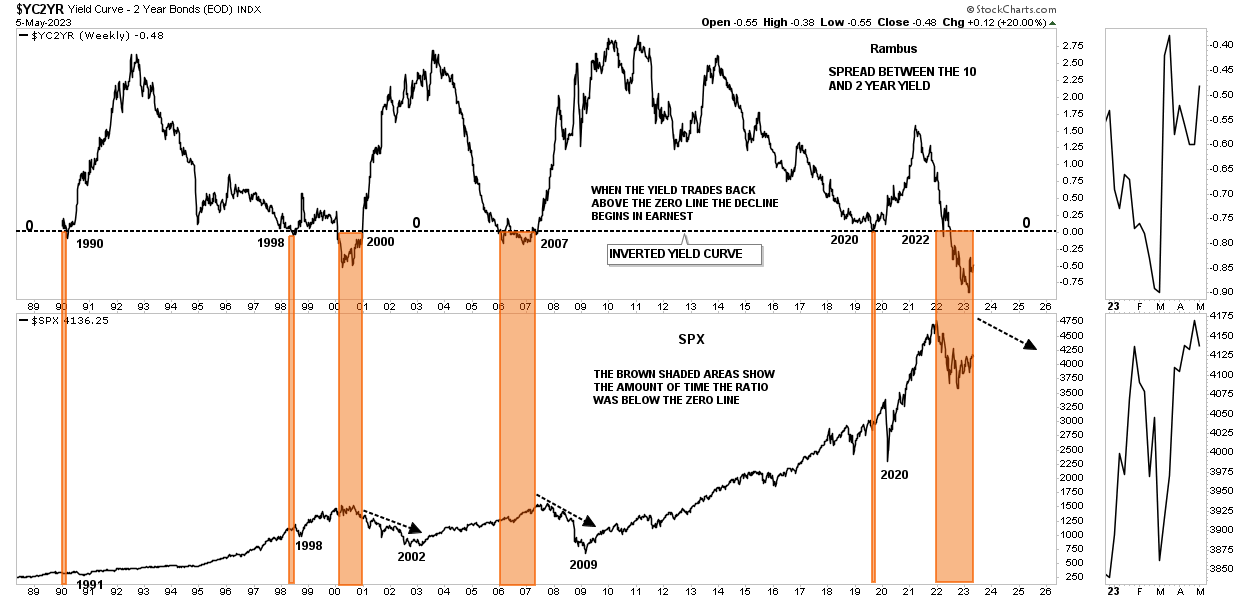
This last chart for tonight is a close up look at the yield curve trading below the zero line. In order to really get the bear market moving lower in earnest we need to see the ratio trade back above the zero line and the potential H&S bottom is strongly suggesting the next move up in the ratio is close at hand.
Until something changes in a significant way I have to believe the Chartology which is still strongly suggesting the 2022 bear market still has further to run. Stay tuned. All at the best…Rambus
US Dollar
Before we look at the Weekend Report I would like to go over the trades in the Kamikaze and PM Stock Trades Portfolio we exited this week on Wednesday the 26th. As you know about a week and a half ago the PM stock indexes formed a small H&S top which is a reversal pattern no matter how small it may be. I’ve mentioned many times to never underestimate a H&S reversal pattern. Many times they can be the start of a bigger move or their measured move which in the case of the recent small H&S top is just below the 38% retracement. So for the time being I decided to lock in our profits and await the next setup.
Breaking down the PM Stock Trades Portfolio we had a total of 23 positions with three positions being a half position. We began the accumulation process on March 17th and closed out the trades on April 26th for a total of 6 1/2 weeks.
We had 16 winners for a total of $7565.90 and 8 losing positions for a loss of $3036 for a net gain of $4529.90 which was well below what I was hoping for when we began the accumulation process back on March 17th. At this point it is too early to know if I made the right decision going to cash, but we are now back to neutral with our trading capital safe and sound.
The Kamikaze Portfolio worked out much better as we had 20 out of 20 winning trades locking in $14,047 in profits. Between the two portfolios we had a grand total of 36 winning trades with 8 losing trades which came to a profit of $18,576.90 over the last 6 1/2 weeks.
The history for each trade is listed on the sidebar under the Kamikaze and PM Stock Trades Portfolios. To see the complete history for each trade it is best to scroll all the way down to the bottom where the first trade was made and then scroll up to see the updates.
I want to make it perfectly clear that I haven’t given up on the PM complex as there are still some very good looking chart patterns with longer term potential which you can see if you click on the trades in the PM Stock Trades Portfolio especially the weekly charts.
On to the Weekend Report.
Tonight I would like to look at the US dollar and some other currencies that are going to have a big impact on the PM complex and commodities in general. It is not a perfect inverse correlation, but generally when the US dollar moves lower that is generally a bullish setup of the PM complex and commodities and just the opposite when the US dollar is rising. With that in mind lets look at some different charts for the US dollar from combo charts to ratio combo charts.
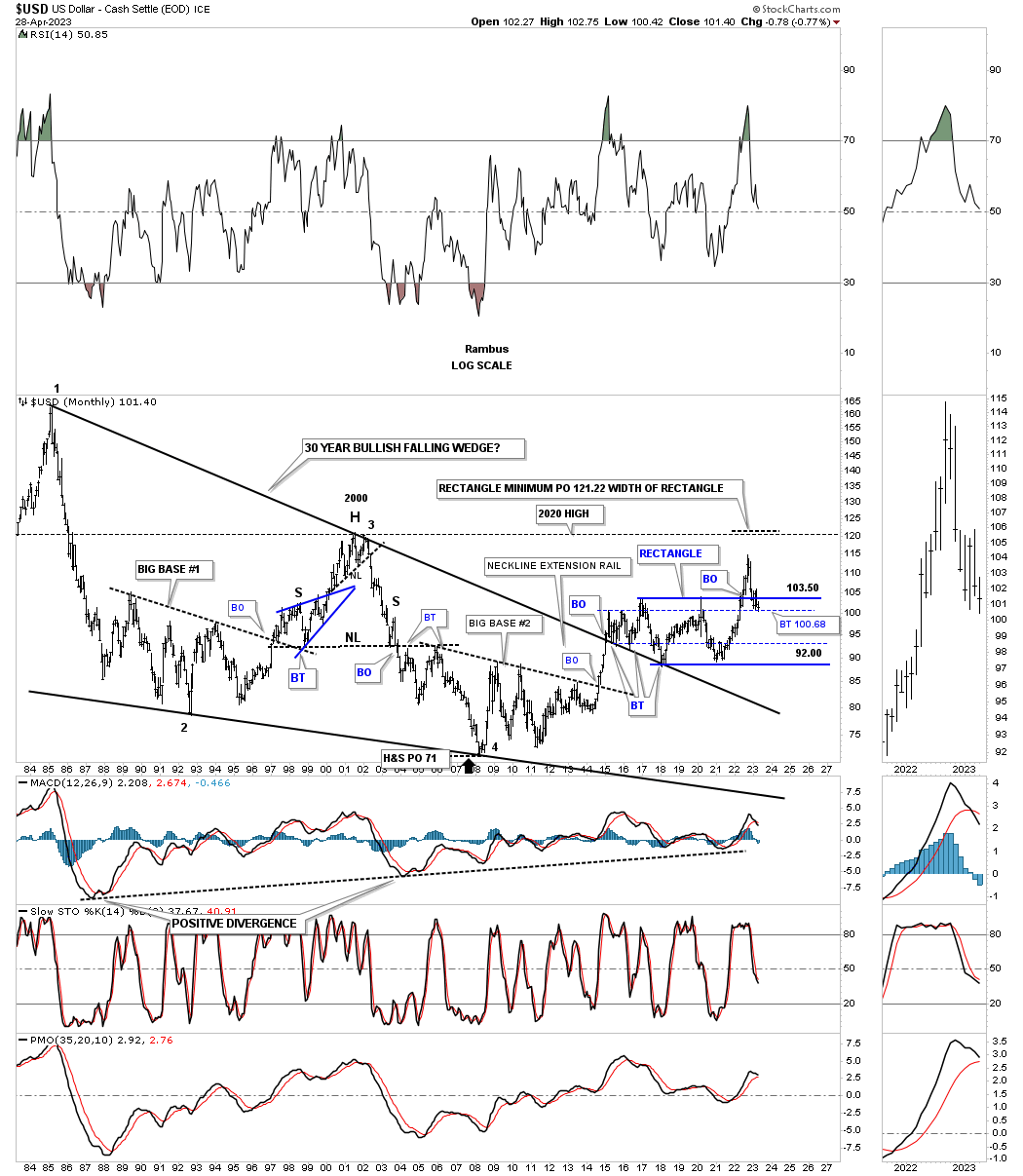
This first chart is a weekly bar chart which shows the 2021 H&S bottom and the strong impulse move into the 2022 high. From that high the US dollar has been in a strong decline and could very well be forming a H&S top that we’ve been following on the weekly line chart in the, Markets Update. Close but no cigar yet.
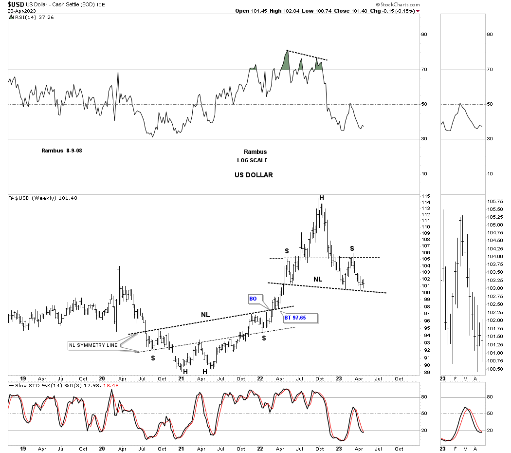
This next chart for the US dollar is a weekly look which shows the massive rectangle consolidation that had built out since the 2017 first reversal point high. As you can see the US dollar had a strong breakout move, but the rally was so strong that it needed to consolidate those gains or backtest the top rail of the black rectangle. So far the US dollar has had a strong backtest and has been finding support on the secondary support line taken from the failed rectangle that formed the top rail of the one year rectangle with the failed breakout back in 2016. At this point I would have to view the breakout above the top rail of the 2017 rectangle as a false breakout until the price action can trade back above that important trendline. Note the positive divergences on the two previous lows in the 2017 rectangle.
Here again you can see how the 2017 rectangle fits into the bigger picture within the major bull market uptrend channel.
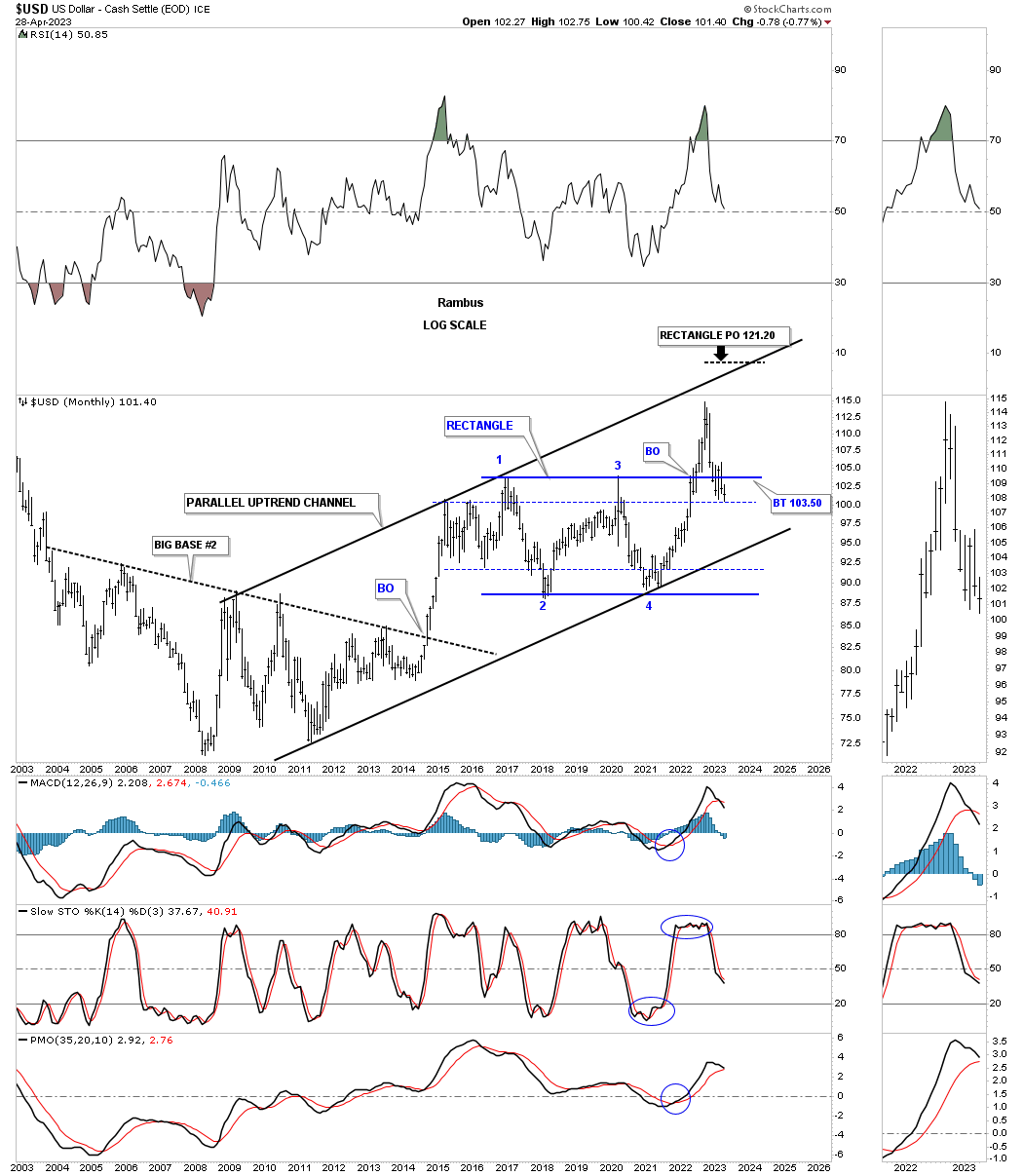
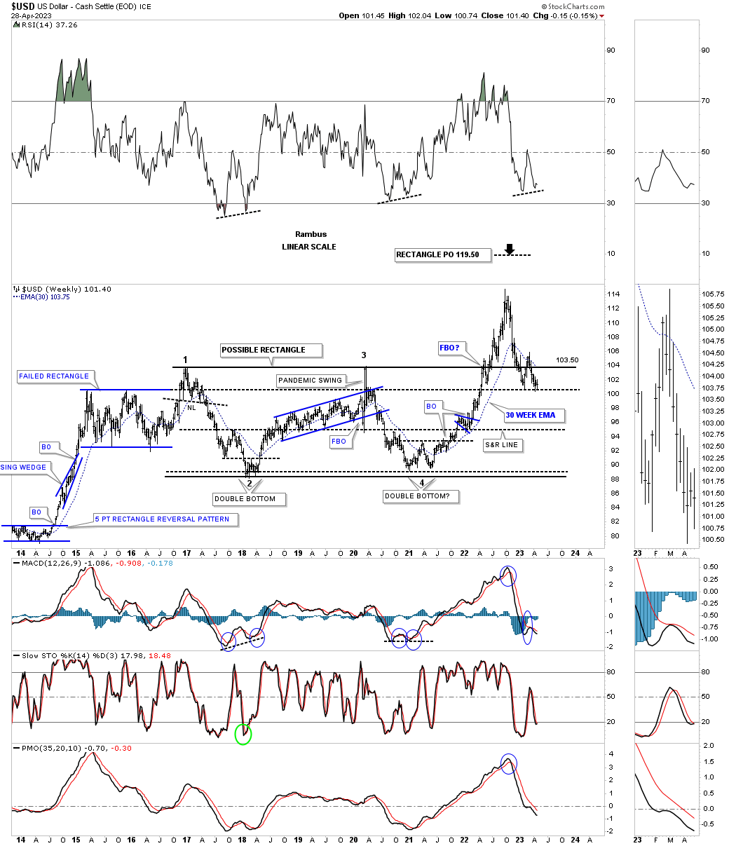
Next is the very long term monthly chart showing the massive bullish falling wedge which has seen three backtests to the top trendline and the rectangle that has been forming just above the top trendline. The key to the bullish scenario would be to see the secondary support line hold and then a move back above the top trendline of the blue rectangle. The bearish case would be to see the US dollar trade below the secondary support line and make a new low since the 2022 high.
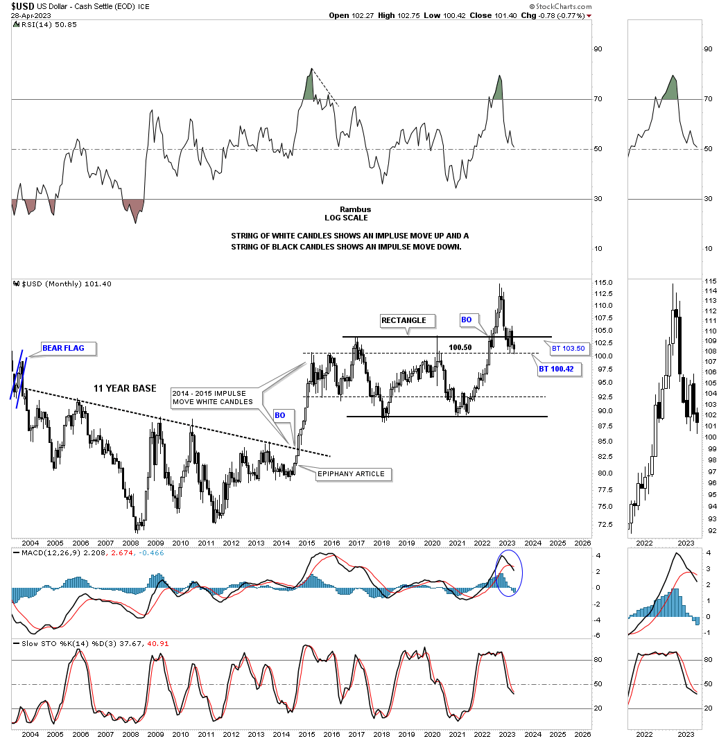
Below is the old epiphany chart showing the massive impulse move out of the 11 year base back in 2014 with the string of white candlesticks all in a row up to the actual beginning of the sideways trading range in 2014.
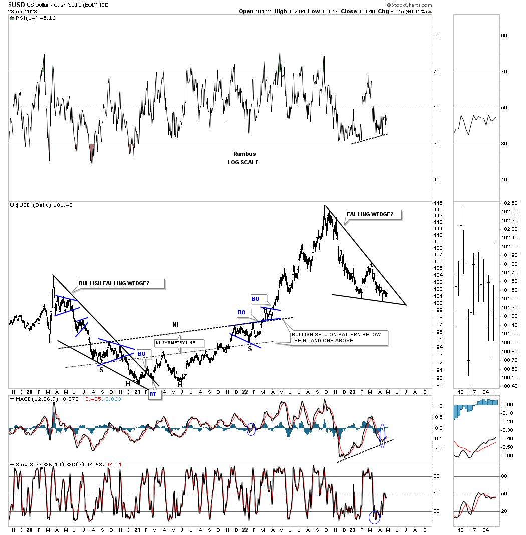
We’ve been following the potential H&S top on the weekly chart, but there is another chart pattern that could be forming which is the falling wedge if the price action can trade above the top trendline. Note the positive divergence on the RSI and MACD.
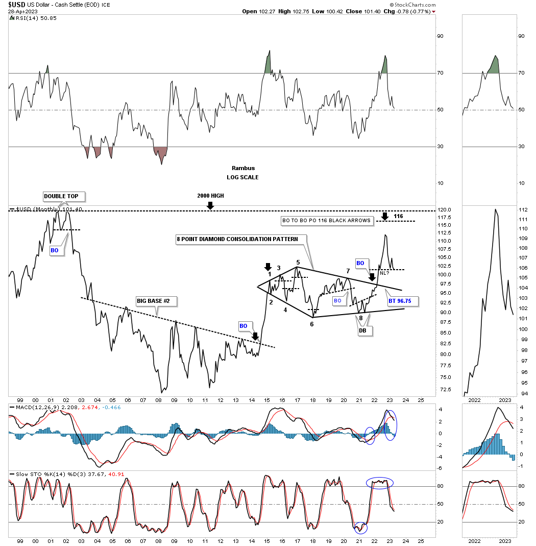
This is another old chart I’ve posted several times in the past which shows the eight point Diamond consolidation pattern which had that massive breakout move. As you can see the current price action is testing the possible neckline of the H&S top we’ve been following which won’t be complete until the neckline is broken to the downside.
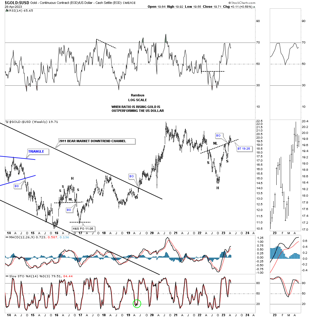
This next chart is a ratio chart which compares Gold to the US dollar. Here again you can see another important inflection point with the possible backtests to the neckline underway.
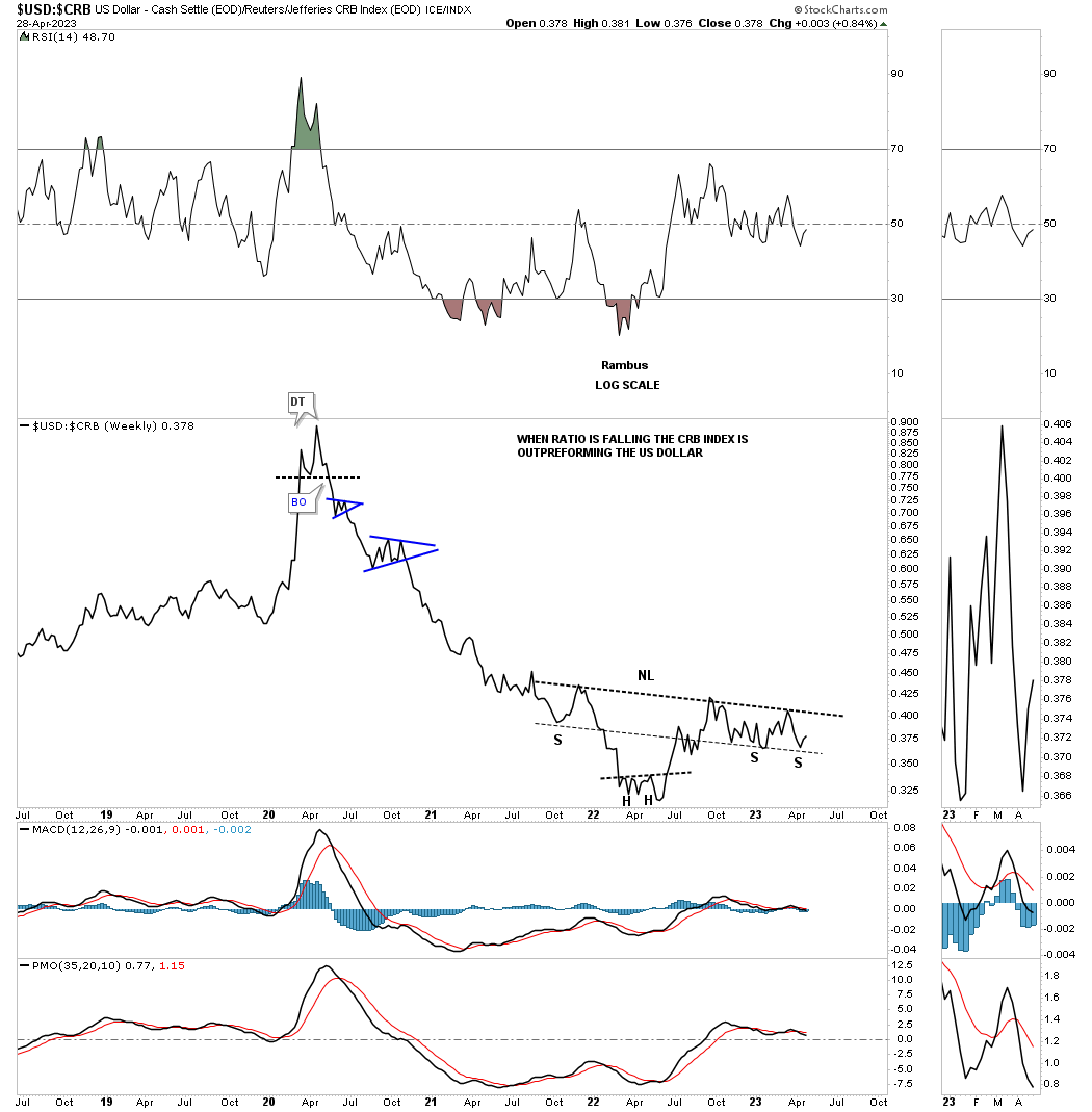
This next ratio chart compares the US dollar to the CRB index using a weekly line chart. During the pandemic crash low in early 2020 the commodities complex began a very strong rally that lasted almost exactly two years. After such a massive rally vs the US dollar you can see a potential inverse H&S bottom forming which still has more work to do, but if the H&S bottom completes that means the US dollar is going to outperform commodities and what will that mean for the inflation / deflation debate?
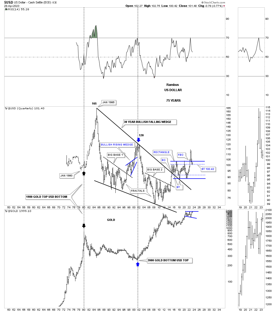
Below is a very long term quarterly combo chart showing the history for the US dollar on top with Gold on the bottom. Note the critical inflection point with the US dollar possibly finding support on the secondary support line while Gold is trading close to the top of its 2020 trading range.
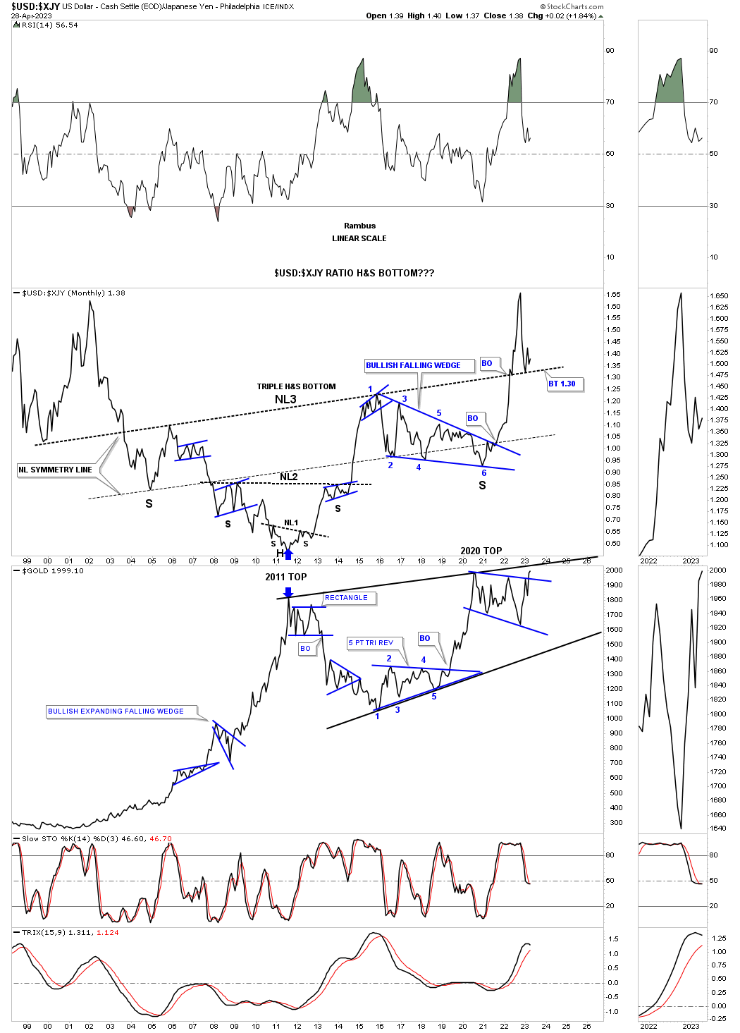
Next is another very long term ratio chart we’ve been following since 2014 which compares the US dollar to the Japanese yen. Some of you may recall that massive blue bullish falling wedge right shoulder that seemed like it would never end. When the end came the impulse move we had been waiting for took off like a rocket and finally took out the neckline. Since the breakout above the neckline the price action has pulled back to the neckline in a possible backtest.
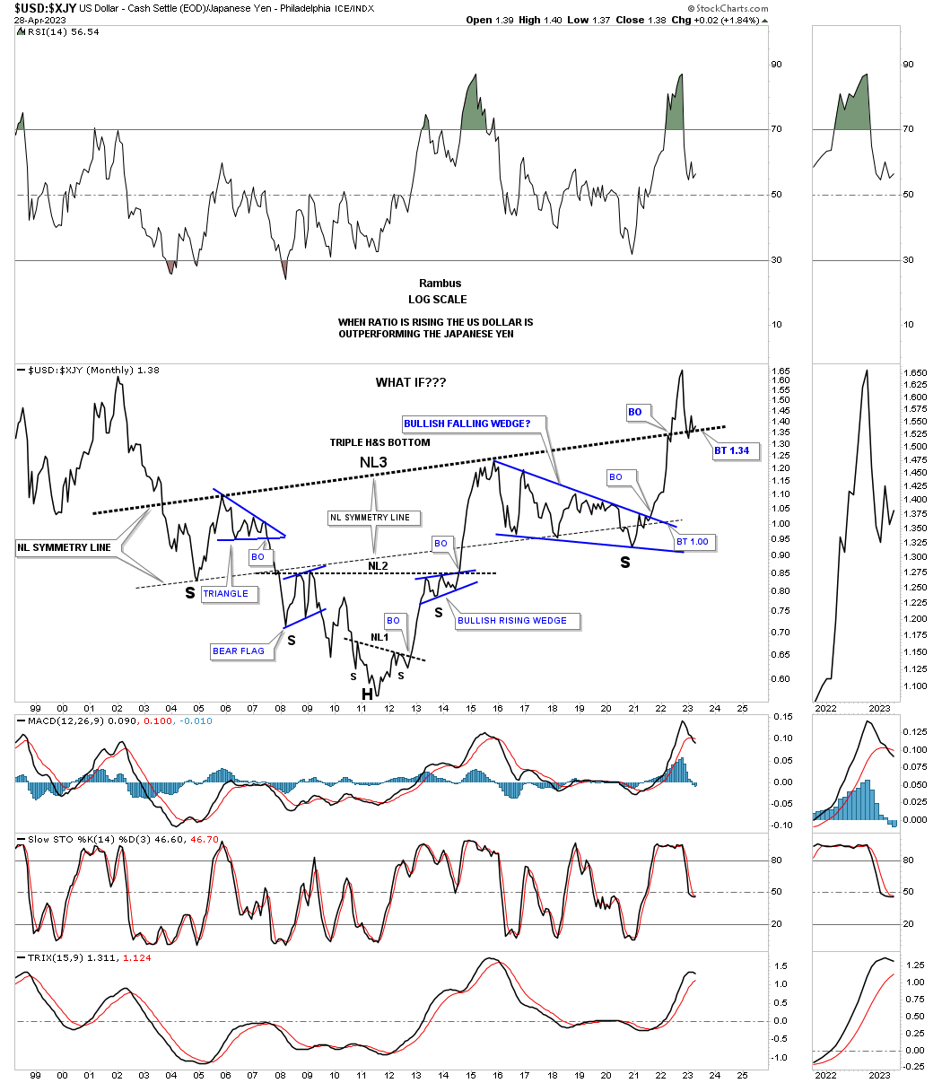
Why is that potential massive triple H&S bottom on the monthly chart above so important is because Gold generally moves opposite to the ratio. Below is the long term ratio combo chart which has the US dollar: XJY ratio on top with Gold on the bottom. Here once again you can see the critical inflection point that Gold has vs the ratio chart with the ratio looking for support on the backtest while Gold is finding initial resistance at the top of its 2020 trading range.
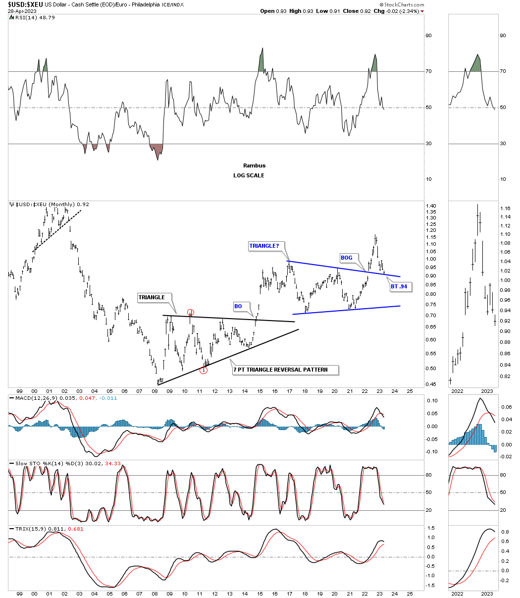
Next is another ratio chart which compares the US dollar to the XEU. When the ratio is rising the US dollar is outperforming the XEU, euro. As you can see in early 2022 the ratio broke out to the topside of the blue triangle consolidation pattern with a big breakout gap on this monthly chart which is very rare. Now the critical backtest is in play
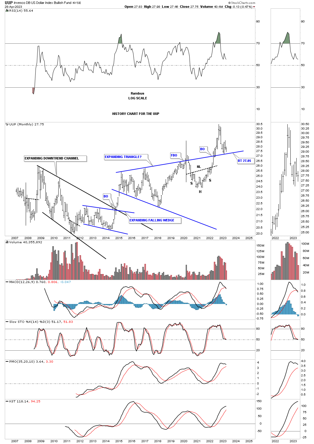
This last chart for tonight is the history chart for the UUP which gives us a different perspective. First you can see how the top rail of the expanding falling wedge has been holding support since the breakout in 2022. You can also see how that H&S top we’ve been following on the weekly line chart during the, Markets Update, could be forming above the top trendline. This shows another important inflection point from a different perspective.
My goal as a trader is to always be objective and keep an open mind. When the charts change I too must change and at critical inflection points, that we’ve looked at tonight, it is more important than ever. The US dollar is going to be key going forward and I will have to adjust my game plan for the PM complex on what the US dollar gives us to work with. Have a great rest of the weekend and all the best…Rambus
Gold & Silver
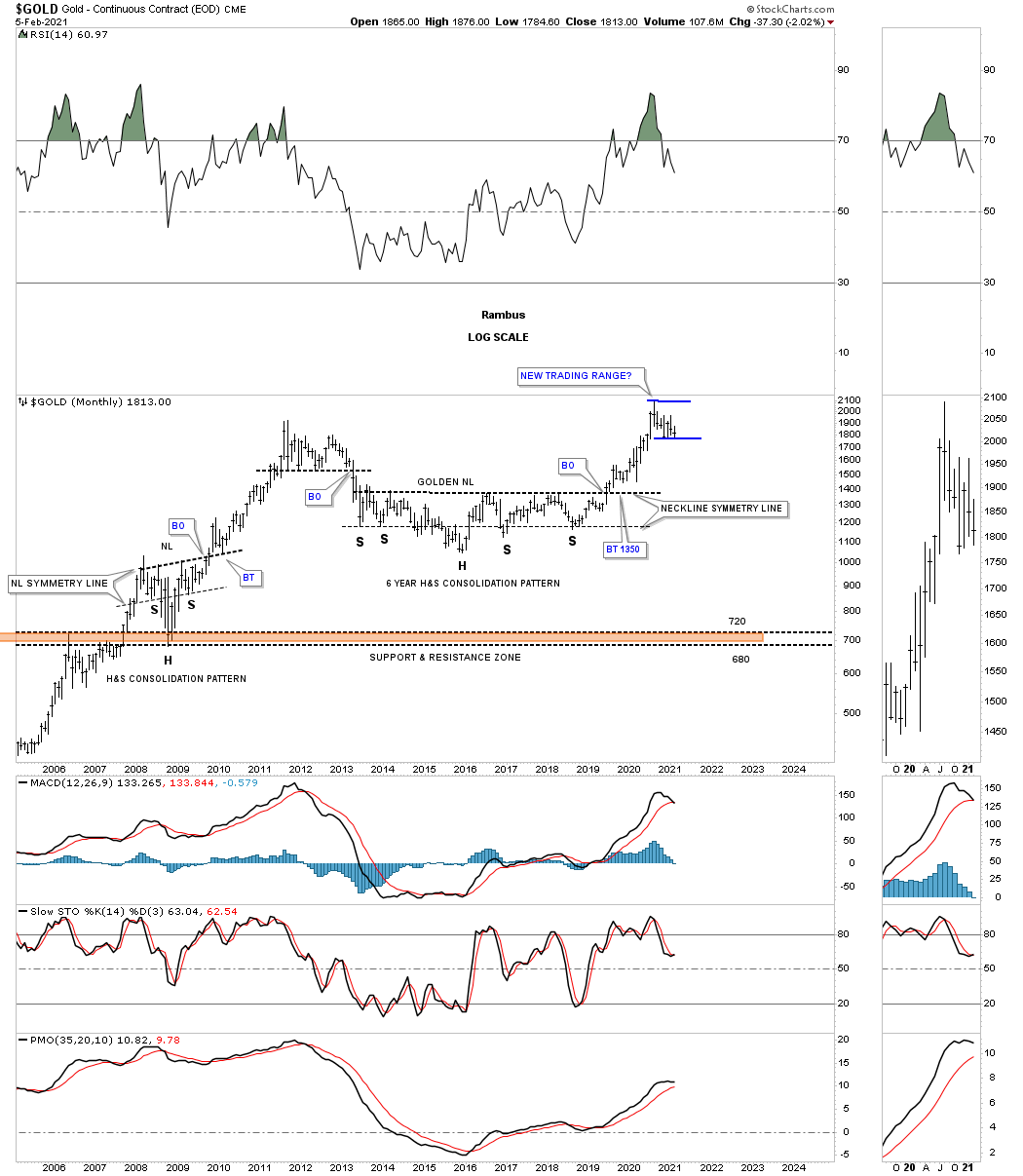
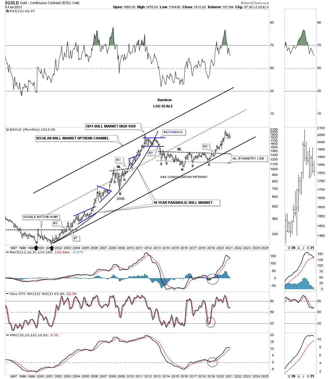
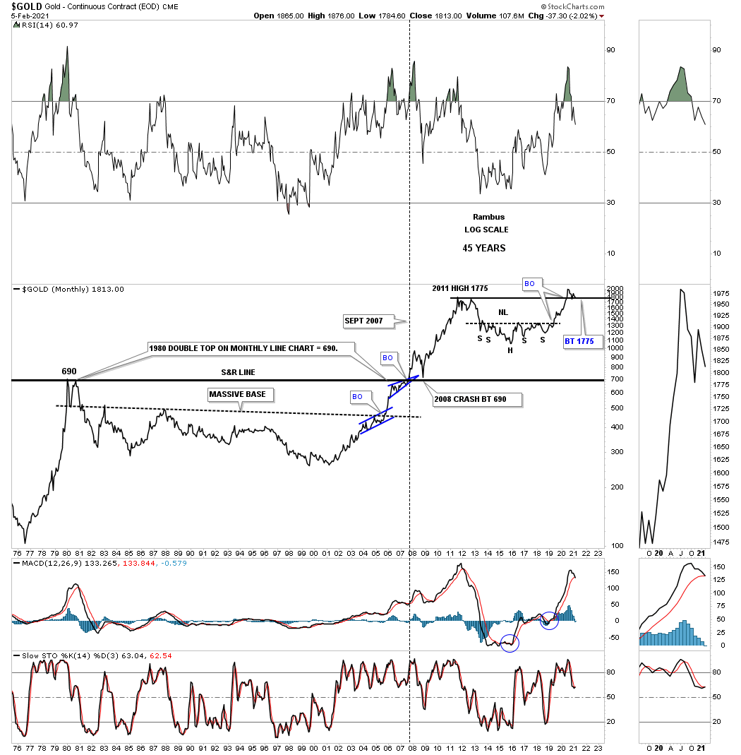
Tonight I would like to go down memory lane back to a Weekend Report I did back on February 5th 2021 well over two years ago. In that post Gold had just completed the first leg up since building out the massive 2016 H&S consolidation pattern. After a nearly two year impulse move I began to look for some type of consolidation pattern to start forming to consolidate those large gains.
This first chart shows a monthly chart for Gold going back to the 2008 crash low which produced the very symmetrical 2008 H&S consolidation pattern which led Gold up to its 2011 bull market high back then. After the 2011 high Gold’s bear market would begin, that would last until the head of the 2016 H&S bottom was in place. There was no way to know back then that the 2016 low would be the 2000 secular bear market low dividing the first and second leg up.
About a year or so after the 2016 H&S consolidation pattern low began to take shape I coined the phase, Golden Neckline. It would still take a few more years for the 2016 H&S consolidation pattern to complete, but all the pieces of the puzzle were in place at which point it became a waiting game.
Below is what I wrote back on February 5th 2021 and what the Gold monthly chart looked like back then.
FEB 5th 2021:
This monthly chart for Gold shows the golden neckline with the current trading range in blue forming. We still don’t know what type of consolidation pattern will finally show itself. We could see a bull flag with lower highs and lower lows or a triangle of some kind but what we do know is that whatever consolidation pattern finally shows its hand there will be no doubt that the impulse move will take Gold up into new all time high territory.
This next long term chart goes back to the February 5th Weekend Report showing the first leg up in Gold’s secular bull market that started in 2000 and lasted until the 2011 high and then the bear market with the 2016 H&S consolidation pattern. I was then able to connect the 2000 low to the 2018 right shoulder low showing the longer term secular bull market uptrend channel that is still in play. Note where Gold was trading at the time which was just beginning to start the 2020 consolidation pattern. I was comparing how small the current trading range was compared to the blue consolidation patterns that formed from the 2000 bear market low to the 2011 bull market high.
Feb 5th 2021:
We’ve looked at the secular bull market for the HUI and Silver now its time to look at Gold’s secular bull market. Note how much smaller our current trading range is compared to those in the first leg up in Gold’s secular bull market. Again, there is no law that says there has to be a one year plus consolidation pattern, but the odds are strongly suggesting one.
April 23rd 2023:
Below is the current chart for Gold’s secular bull market and what has transpired since the Feb 5th 2021 Weekend Report. As you can see Gold did trade sideways until the bottom trendline of the 2000 secular bull market was touched.
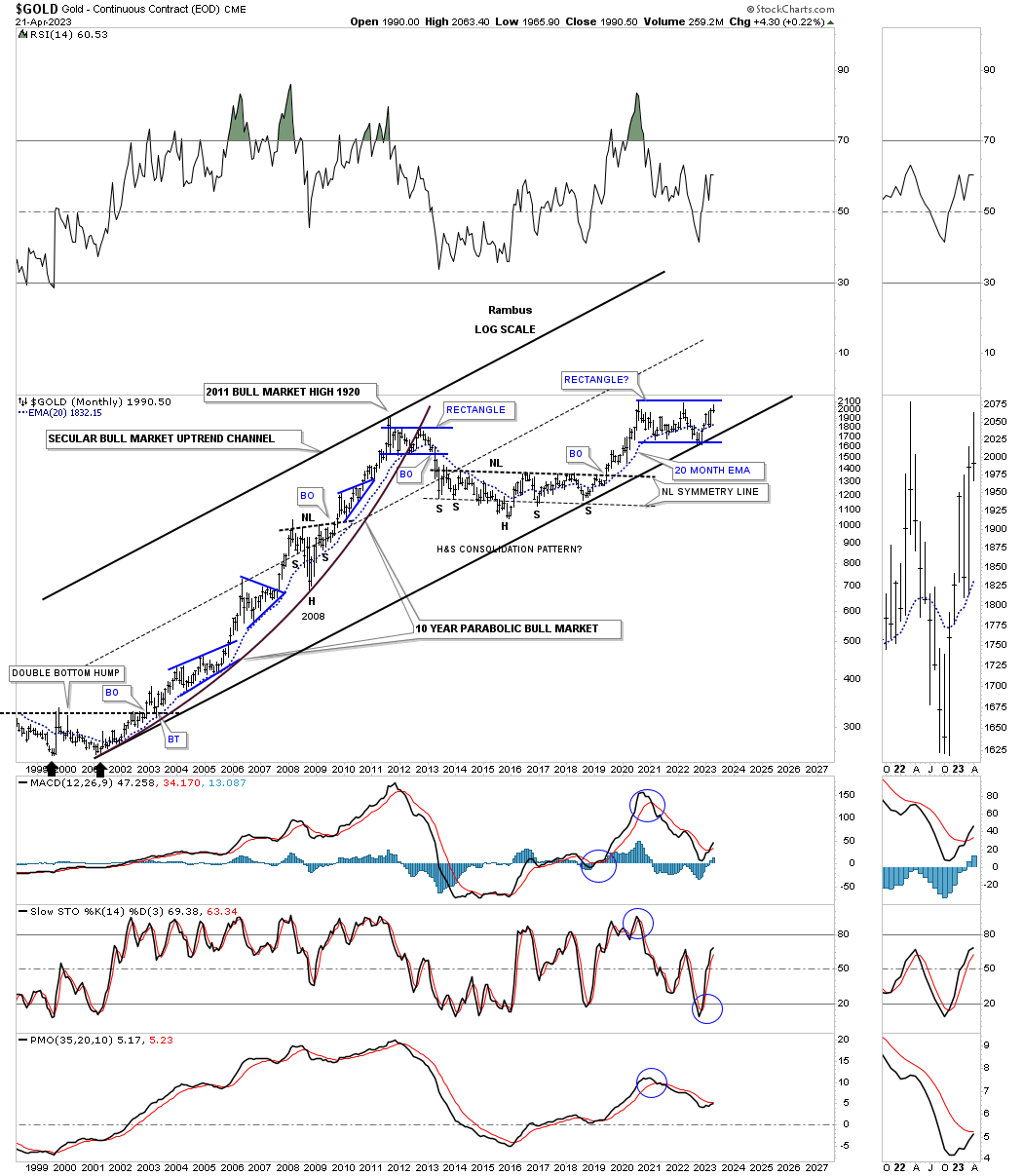
In that February 5th Weekend Report I showed this chart for Gold showing how Gold could be forming a similar trading range to the 2012 blue trading range using reverse symmetry. The blue arrows show how we could see the new trading range develop over the next year or so which again was based on the 2012 rectangle.
Feb 5th 2021:
Is it possible that Gold could build out a reverse symmetry rectangle similar to the one it formed in 2012? The price action is currently sitting on the 10 month ema which is showing up at the bottom of the potential new trading range.

April 23rd, 2023:
This current chart for Gold shows what took place over the last two years since the February 5th 2021 report. This monthly chart shows Gold traded slightly below the bottom rail of the 2020 trading range at the 4th reversal point which ended up being a double bottom / false breakout. Now Gold is back up to reversal point #5. Both the 2012 and 2020 trading ranges are the exact same height as shown by the blue arrows but the time component is getting longer in the 2020 trading range vs the 2012 trading range. That could mean with the completion of the 4th reversal point that the 2020 trading range may not have a 5th and 6th reversal point as the 2012 rectangle.
Feb 5th:
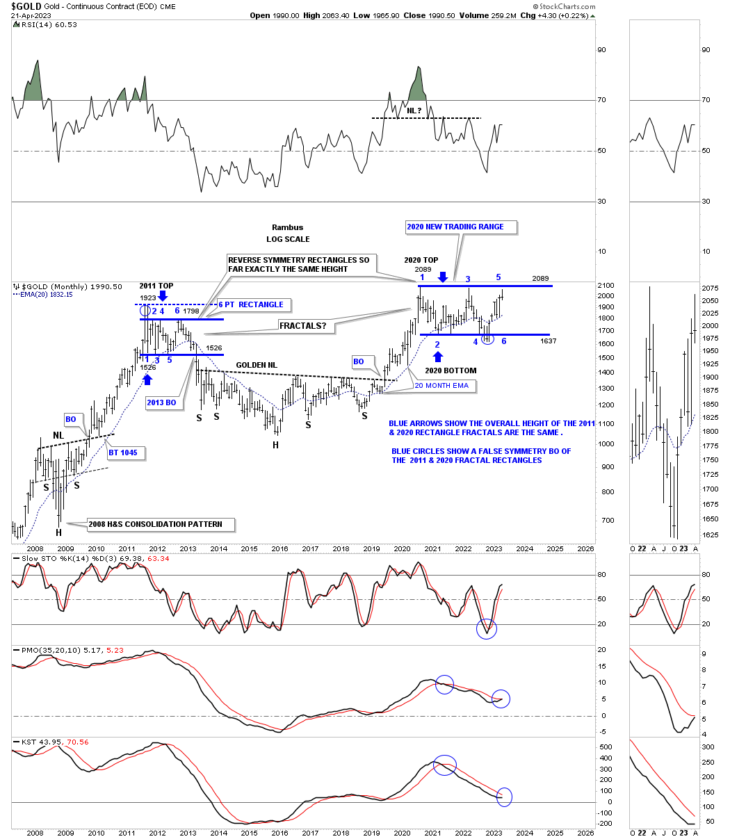
If Gold can close the first quarter of 2021 at or above the old 2011 high that would be a very bullish development because if support holds on a quarterly chart that is usually very important support as you can see at the bottom of the 2008 crash low
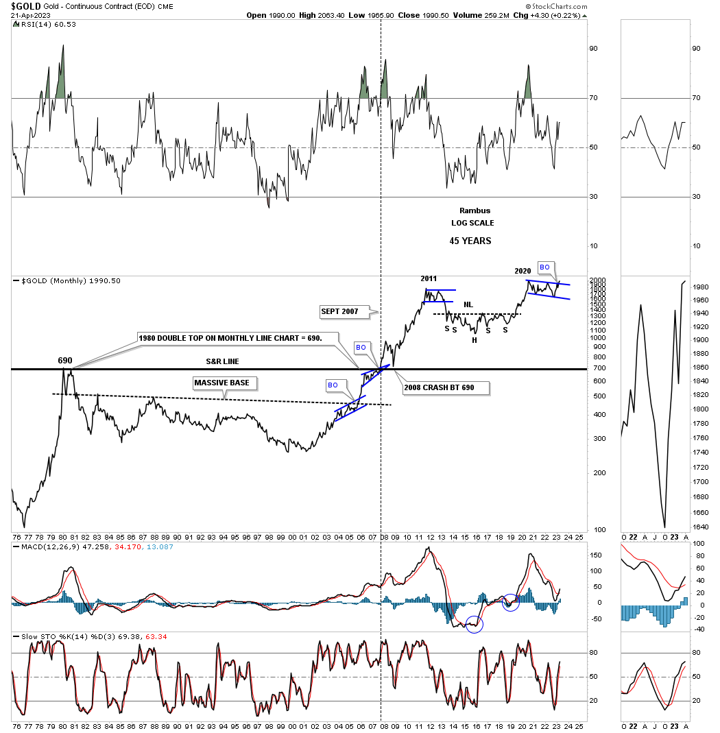
April 23rd 2023:
This is what has taken place since the February 5th Weekend Report on the long term monthly line chart. Note the small blue bullish rising wedge which formed just below the 1980 S&R line that we’ve seen many times at other important trendlines before the breakout occurs. Also note where the 2008 crash low found support just before the rally phase to the 2011 high. A strong shakeout before a strong impulse move.
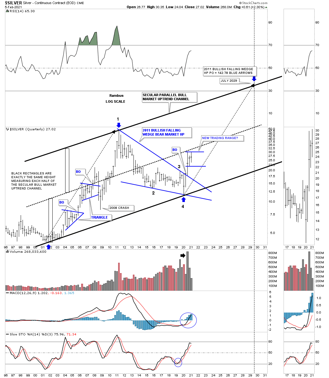
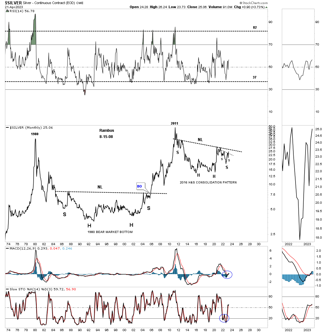
In that February 5th Weekend Report I also showed this long term chart for Silver and what I was thinking at the time. What this first chart shows is Silver’s secular bull market that began at the 2001 bear market low. The black arrow shows the angle of the 2001 low to the 2011 high which ended the first leg up. Note how that long black arrow shows the two triangles that formed just below it. The point I was making with this chart was that the rally out of the 2020 low was so strong and powerful that it reached the center dashed midline way too early and was going to need to consolidate those gains and build up some more energy to launch the next leg higher.
Since I had no idea of what type of consolidation pattern may form I just used the two blue horizontal lines showing a potential top and bottom of whatever trading range may form.
February 5th 2021:
This last chart for Silver shows its secular bull market uptrend channel with the 2011 bear market bullish falling wedge which I’m viewing as a halfway pattern. The biggest problem most investors face in any bull market is the time component. Just because there is a bull market, most of the time the price action is building out some type of consolidation pattern which will lead to the next impulse move higher. I’ve mentioned this so many times in the past that the job of a consolidation pattern is to wear you out and is no fun when the price action chops around for weeks or months at a time going nowhere fast.
A good example of this is the first blue triangle consolidation pattern that formed just after the initial impulse move up out of the 2001 low on this quarterly bar chart. That first consolidation pattern that formed during the first leg up in Silver’s new secular bull market took right at 7 quarters to complete which represents a little less than 2 years of consolidation before the 2nd impulse move in the secular bull market began. It is the impulse move that is so much easier to trade than a consolidation pattern.
After one year of the impulse move up it was time to consolidate those gains and Silver formed its 2nd consolidation pattern which was another 7 quarter blue triangle. After the breakout the price action looked good with the new impulse move up until everything crashed, stock markets, commodities and the PM complex into the 2009 crash low.
Now lets look to the right side of the chart and our current trading range that is now in its 3rd quarter of construction. There is no law that says this current trading range has to take 7 quarters to complete, but time wise it should take longer than 3 quarters especially if you look at the size of the first impulse move out of the March 2020 crash low. At a bare minimum I would at least expect to see one more move down toward the bottom of the trading range to put in a solid 4th reversal point. How long that takes is anyones guess at this point.
The main point to understand about this long term quarterly chart for Silver is the very strong breakout move above the top rail of the 2011 bear market bullish falling wedge on a massive increase in volume. The stronger a breakout move out of any consolidation pattern sends a very importantl message that you can expect a powerful impulse move higher. The hard part is to have the patience and understanding to know what is happening in real time. For many investors that did well during the impulse move, end up giving most of their profits back thinking they can out smart the markets while trading inside of the consolidation pattern. I’m not saying it can’t be done, its just so much harder than holding on during an impulse move.
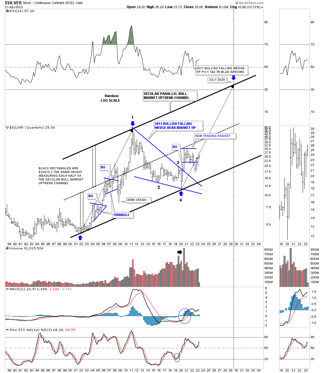
April 23rd 2023:
Below is the exact same chart as the February 5th 2021 chart above and how the consolidation phase is playing out. The most important part to understand is how the blue trading range traded sideways until it came in contact with the black arrow starting at the 2020 low. Silver is now back to a more sustainable trend trajectory which matches the 2001 to 2011 rally phase.
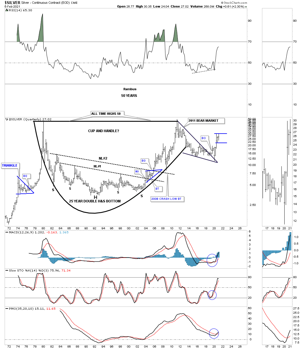
Also in the February 5th Weekend Report I showed this old quarterly chart for Silver showing its massive cup and handle with the double H&S bottom. Here again you can see the 2020 blue trading range that was just beginning to form.
SILVER Feb 5th:
Silver’s potential cup and handle with the current blue trading range under construction. Note the very symmetrical 25 year double H&S bottom with a breakout and backtest to both necklines.
Today April 23rd 2023:
This is how the blue 2020 trading range has been playing out over the last two plus years.
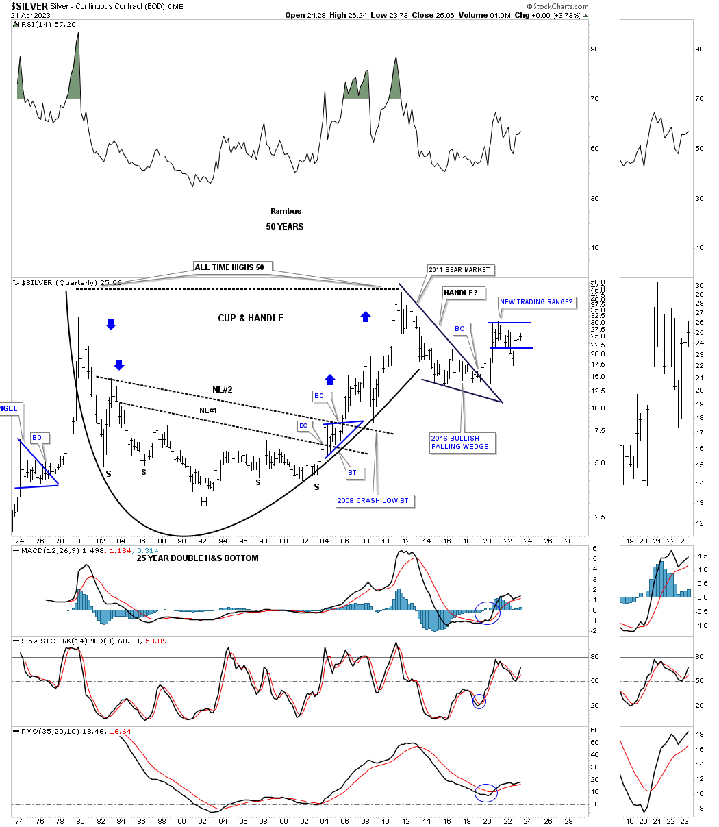
I would like to end this Weekend Report by looking at a 50 year monthly line chart for Silver which shows it massive 25 year H&S bottom which launched its secular bull market. Shortly after its 2011 high was made Silver began to form its second massive H&S bottom with this one being a consolidation pattern because it is forming above the 25 year H&S bottom. Note the price action within the right shoulder which appears to be a H&S right shoulder consolidation pattern with a breakout in place.
The price action I wrote above back on February 5th 2021 is still in play to this day. I have mentioned many times in the past that when you see a big chart pattern building out well before it is completed can wear you out waiting for it to come to fruition. We have been living a perfect example of this for well over two years now. I’m going to say this for the millionth time regardless of how redundant this message is, but big chart patterns lead to big moves. OK I’ve said it again after promising not to, but I just can’t help myself because it is so true. Please accept my apology until the next time. All the best…Rambus
SILVER April 23rd 2023:
Related Reading:
- Rambus: Blockbuster Chartology – January, 2023
- Rambus: Blockbuster Chartology – October, 2022
- Rambus: Blockbuster Chartology – July, 2022
- Rambus: Blockbuster Chartology – May, 2022
- Rambus: Blockbuster Chartology – February, 2022
- Rambus: Blockbuster Chartology – October, 2021
- Rambus: Blockbuster Chartology – July, 2021
- Rambus: Blockbuster Chartology – April, 2021
- Rambus: Blockbuster Chartology – January, 2021
- Rambus: Blockbuster Chartology – October, 2020
- Rambus: Blockbuster Chartology – July, 2020
- Rambus: Blockbuster Chartology – May, 2020
- Rambus: Blockbuster Chartology – January, 2020
- Rambus: Blockbuster Chartology – October, 2019
- Rambus: Blockbuster Chartology – July, 2019
- Rambus: Blockbuster Chartology – April, 2019
- Rambus: Blockbuster Chartology – January, 2019
- Rambus: Blockbuster Chartology – October, 2018
- Rambus: Blockbuster Chartology – July, 2018
- Rambus: Blockbuster Chartology – April, 2018
- 2017 Annual Wrap Up – Does Your Pension Fund Have A Deep State Drain? – January, 2018
- 1st Quarter Wrap Up 2018 Web Presentation
- Blockbuster Chartology with Rambus – October, 2017
- Blockbuster Chartology with Rambus – July, 2017
- Blockbuster Chartology with Rambus – May, 2017
- Blockbuster Chartology with Rambus – January, 2017
- Blockbuster Chartology with Rambus – October 20, 2016
- Blockbuster Chartology with Rambus – July 21, 2016
- Blockbuster Chartology with Rambus – April 21, 2016
- Rambus: Are We in a Deflationary Spiral? – January 28, 2016
- The Dollar, Gold & the S&P 500 with Rambus – October 15, 2015